 |
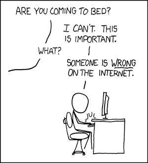
| Courtesy of xkcd - The best webcomic. |
The internet has produced a great many things. In sparking everything from social revolutions to complete government overhauls, the vast network of people has already proven its worth ten times over. In order to get to the worthy stuff, though, one must sledge through a wasteland of content that can best be described as fucking terrible.
And you don't have to worry. Cat-related content is left off this list because of its glaringly obvious unnecessity.
1. Franchise Mashups.
 |
| Hellboy/Peanuts - FUCKING. WHY. |
The core concept behind franchise mashups is best explained in bro-speak: "Dude, what if you, like, took one thing, and made it look like another thing?"
There is no attempt at insight, no loving homage, and besides occasionally ability of their creator to mimic someone else's work, absolutely no point to the franchise mashup. The only reasonable explanation for why anyone should ever feel the need to draw a picture of Han Solo and Chewbaca, "and like, make them look like Calvin and Hobbes" is to perhaps draw some correlation between similarities in a character dynamic. Of which there are none.
People seeking an interesting repurposing of beloved characters should look to something like Scott C's Great Showdowns.
 |
| Star Trek/Reservoir Dogs: It works because they're both about groups of people. |
 |
| The Big Lebowski/Jaws - I guess this one actually makes sense, as Jeff Bridges devours John Goodman in the opening scene of The Big Lebowski. |
 |
| I think we're done here. |
There seems to be widespread misconception across the internet about what exactly an infographic is. Unfortunately for the people out there producing genuinely interesting and well-made infographics, the vast majority of infographics on the webz fail to represent information graphically, instead just listing facts next to pictures.
Meanwhile, in addition to not understanding the purpose of an infographic, some just suck.
 |
| Did the world really need this? And yes, I've cropped out the website name. I didn't want anyone to get blamed for this. |
 |
| SO CLOSE! Now, take this, and make it better. As much as I love the concept, but why why WHY would you overlay the monster silhouettes on top of each other? |


No comments:
Post a Comment